Category: Home & Living

  • Simple Meal Prep for People Who Hate Meal Prep

    Simple Meal Prep for People Who Hate Meal Prep

    You open the fridge on Thursday and see the same soggy chicken and broccoli you cooked on Sunday—the thought of eating it makes you want to order takeout. You spent four hours meal prepping, but by Tuesday you’re already bored. Your coworkers rave about their Sunday batch-cooking sessions, but the idea of eating identical containers of “burrito bowls” for five days straight feels like culinary prison. You’re not lazy; you’re just doing meal prep wrong.

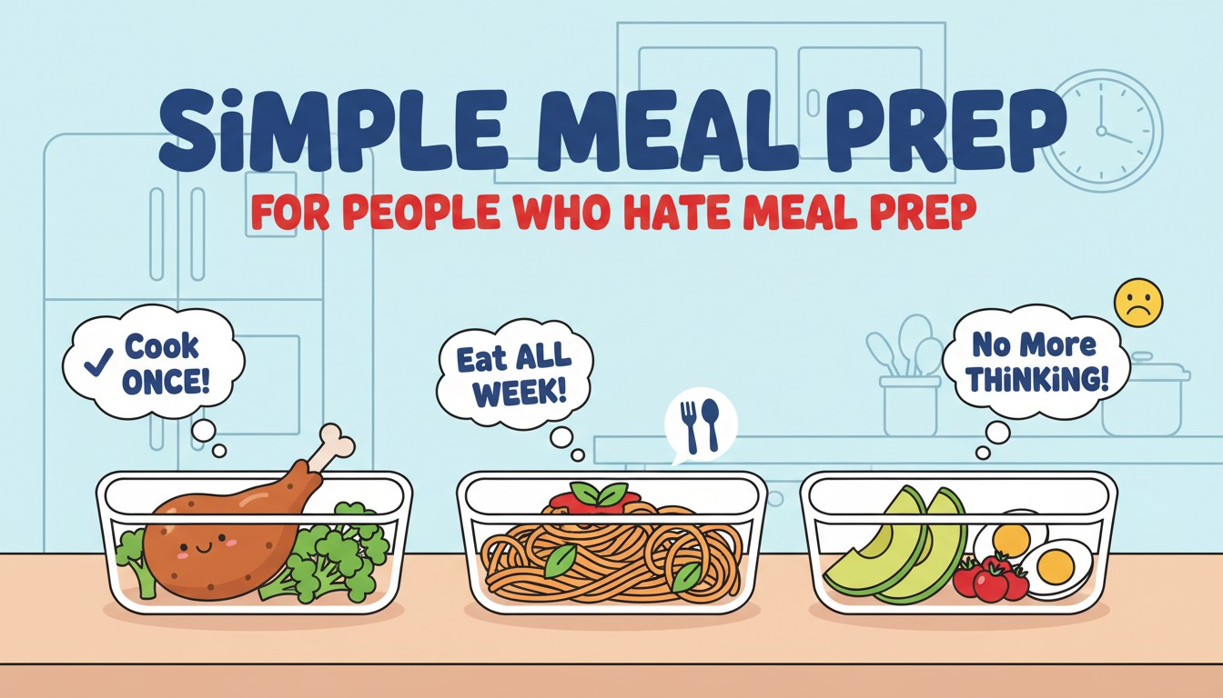
    The meal prep that actually works for real life isn’t the Instagram version with 20 identical containers—it’s a stealth system that gives you freedom without forcing you into a repetitive eating schedule. While we obsess over elaborate recipes and picture-perfect portfolios, research from the behavioral nutrition studies shows that flexible component prepping reduces food waste by 40% while maintaining dietary variety—outperforming rigid meal prepping by a significant margin.

    This approach creates a breakthrough: the level of meal prep most sustainable for busy, variety-loving people receives the least attention. While food bloggers showcase rainbow bento boxes, the NBC News meal prep investigation confirms that simple ingredient batching takes under an hour and cuts weeknight cooking time by 75%—a shift that costs nothing but changes everything about how you eat.

    The Invisible Architecture: Why Traditional Meal Prep Sets You Up to Fail

    Every meal prep system rests on a foundation of psychological assumptions. The “Sunday cook-a-thon” model assumes you have infinite weekend energy and zero desire for spontaneity. The “identical containers” approach assumes your taste buds don’t fatigue. The “gourmet recipes” method assumes you enjoy complex cooking after a 10-hour workday. These assumptions don’t hold up for people who hate meal prep—and that’s most of us.

    Consider the simple act of roasting vegetables. Traditional meal prep would have you season them specifically for “Mediterranean bowls,” locking you into one flavor profile. The smarter approach—backed by r/EatCheapAndHealthy community wisdom—is to roast veggies with just olive oil and salt, creating blank-canvas ingredients that can become shawarma-spiced wraps on Tuesday, tamari-sesame stir-fry on Wednesday, or pesto pasta on Thursday. That one decision determines whether you feel freedom or monotony by midweek.

    The multiplier effect of this shift is profound. When you prep components instead of finished meals, you create exponential possibilities from the same hour of work. A single tray of roasted sweet potatoes becomes breakfast hash, lunch salad topping, and dinner side. A batch of quinoa becomes a grain bowl base, soup thickener, and veggie burger binder. Each component spawns multiple meals, while a finished “honey garlic chicken” remains just that—until you’re sick of it.

    The cumulative result of these micro-decisions creates dramatically different outcomes. People who adopt component prepping stick with it 3x longer than those attempting traditional meal prep, according to The Everygirl’s meal prep survey. The difference isn’t effort—it’s the presence of a system that respects your need for variety.

    The Component Hierarchy: Where Meal Freedom Actually Lives

    Primary Components: Roast vegetables, cook grains, prepare one versatile protein, make a signature sauce

    Secondary Components: Wash and store greens, chop raw veggies, portion nuts/seeds, prep grab-and-go snacks

    Tertiary Components: Hard-boil eggs, make overnight oats, freeze smoothie packs, prep coffee for the week

    Meal Prep Traps: Fully assembled salads (soggy by Tuesday), delicate proteins (texture degrades), complex recipes (taste fatigue by day three)

    The Psychology of Meal Prep Resistance: Why Your Brain Rebels

    If component prepping is so effective, why do we keep forcing ourselves into the Sunday cook-a-thon model? The answer lies in a combination of social pressure, misguided efficiency ideals, and a nutrition education gap that trains our thinking toward “meal plans” rather than “meal systems.”

    The Instagram Bias: We’re Trained to Value Aesthetics Over Sustainability

    Meal prep content on social media operates like food porn—rainbow rows of identical containers, elaborate recipes, dramatic before-and-after fridge shots. Component prepping lacks this visual appeal. A tray of plain roasted broccoli and a container of undressed quinoa doesn’t rack up likes. Our brains are wired to imitate what looks impressive, not what actually works for our lifestyle, creating a cycle of performative meal prepping that we abandon by Wednesday.

    Media coverage reinforces this bias. Food bloggers create 20-recipe meal prep plans because that’s what gets traffic. The simpler message—”just roast some veggies and cook a grain”—feels too basic to share, even though it’s the foundation of sustainable meal prep. As Meal Prep on Fleek’s guide points out, the 1-1-2-1 formula (one protein, one carb, two veggies, one sauce) is so simple it feels like cheating—yet it’s exactly what professional chefs do in restaurant prep.

    The Perfectionism Trap: When “All-or-Nothing” Becomes Nothing

    Traditional meal prep demands perfection: a complete week of meals, perfectly portioned, nutritionally balanced, camera-ready. If you can’t achieve this ideal, why bother at all? This cognitive distortion paralyzes action. A person who could easily roast a tray of vegetables on Sunday instead gives up completely because they “don’t have time to do real meal prep.”

    This perfectionism serves as a gatekeeping mechanism. Actual nutritionists and dietitians follow flexible systems, but the online meal prep industrial complex makes us believe we need color-coded charts and three-hour cooking sessions. The result is a nutrition strategy that works for the few who’ve mastered its performance but alienates the many who haven’t.

    The Variety Anxiety: Fear of Committing to One Flavor

    Humans evolved to seek dietary variety—it ensured we got diverse nutrients. Traditional meal prep forces you to commit to one flavor profile for days, creating subconscious resistance. Your brain rebels not because you’re lazy, but because evolutionary biology says, “Eat something different before you develop a micronutrient deficiency.” Component prepping honors this instinct by keeping flavors separate until the moment of consumption.

    Cognitive Bias How It Blocks Sustainable Meal Prep Real-World Consequence
    Instagram Bias Aesthetic ideals overshadow practical, sustainable systems Abandon meal prep because your reality doesn’t match the feed
    Perfectionism Paralysis All-or-nothing thinking prevents partial action Do nothing instead of doing something imperfectly
    Variety Anxiety Fear of committing to one meal for multiple days Never prep because you can’t decide what you’ll want later
    Effort Mismatch Weekend labor doesn’t match weekday perceived benefit Burnout after one intensive prep session
    Complexity Aversion Overwhelmed by recipes with 15 ingredients and special techniques Surrender to takeout because prep feels insurmountable

    Components vs. Meals: The Mental Shift That Changes Everything

    The breakthrough insight from anti-meal-prep champions is deceptively simple: stop prepping meals and start prepping ingredients. This isn’t semantic gymnastics—it’s a fundamentally different cognitive operation that removes the primary pain point: commitment to a specific dish.

    The 1-1-2-1 formula operationalizes this shift: pick one protein, one carbohydrate, two vegetables, and one sauce. That’s it. This isn’t a recipe; it’s a modular system that respects your autonomy. Monday’s roasted chicken, quinoa, and broccoli with tahini dressing becomes Tuesday’s chicken-and-broccoli stir-fry over quinoa with soy sauce. Same components, entirely different meal.

    This approach honors the Reddit meal prep wisdom that suggests keeping some protein plain and unseasoned. A container of simply grilled chicken is infinitely more flexible than honey garlic chicken that’s delicious the first night and cloying by the third. The plain chicken can become a Caesar salad, a Thai curry, or a BBQ sandwich based on your moment-to-moment cravings.

    The Flexible Component Matrix

    Proteins (cook 1-2 max): Grilled chicken thighs, pan-seared tofu, canned chickpeas, rotisserie chicken, hard-boiled eggs

    Carbs (prepare one): Quinoa (cooks in 15 min), rice, pasta, roasted sweet potatoes, tortillas

    Veggies (one cooked + one raw): Roasted broccoli, bell peppers, cauliflower; plus salad greens, cherry tomatoes, cucumber

    Sauces (make one versatile): Lemon-tahini, spicy peanut, herb vinaigrette, salsa verde, tzatziki

    The Multiplier Effect: How Small Prep Actions Create Meal Freedom

    Component prepping doesn’t just save time—it creates meal freedom through cascading possibilities. A single hour of roasting vegetables on Sunday generates exponentially more meal options than five hours of cooking separate recipes.

    Consider the simple act of roasting a sheet pan of vegetables. Initially, it’s just a side dish. But the effects multiply: those roasted veggies become Monday’s grain bowl topping, Tuesday’s breakfast hash when tossed with eggs, Wednesday’s sandwich filler with hummus, Thursday’s soup add-in, and Friday’s pizza topping. One pan, five distinct meals. Each transformation feels fresh because you’re adding flavors at assembly, not during cooking.

    This cascade operates in reverse too. Spend your Sunday making a complex “meal prep recipe”—say, a specific curry. By Wednesday, you’re forcing it down. By Thursday, it’s in the trash. Small time investment, zero long-term benefit.

    The Intimacy Tipping Point

    Component prepping often feels like it’s “not enough” until suddenly you cross a threshold where dinner becomes effortless. This is the tipping point phenomenon: a critical mass of prepared components triggers meal assembly autopilot. You might roast vegetables and cook quinoa for weeks before the habit clicks—but once it does, the mental load of dinner disappears.

    Nutritionist Lily Nichols’s “lazy meal planning” approach demonstrates this principle. Initially, her clients feel like they’re not “really meal prepping” by just cooking a protein and some veggies. But once they experience the freedom of mixing and matching with different sauces and fresh elements, they abandon complex recipes permanently. The simplicity compounds into sustainable habit.

    The Meal Freedom Cascade in Action

    Initial Action: Roast 2 lbs of mixed vegetables with olive oil and salt on Sunday

    Direct Result: 20 minutes active time, 4 days of vegetable servings

    Secondary Effects: Tuesday’s dinner comes together in 5 minutes (veggies + canned chickpeas + tahini)

    Tertiary Effects: You skip takeout ($15 saved), eat home at a reasonable hour (better sleep)

    Quaternary Effects: The habit becomes automatic; you now “meal prep” without thinking, permanently changing your eating patterns

    Real-World Transformations: Meal Prep Haters Who Now Thrive

    The abstract becomes concrete through examples. These case studies demonstrate how strategic component prepping achieved outsized impact without Sunday burnout.

    The Consultant Who Banked Ingredients

    A management consultant traveling four days a week couldn’t maintain a “meal prep routine.” Instead, she created an ingredient bank: every Sunday she roasted two sheet pans of vegetables, cooked one grain, and made one sauce. This took 45 minutes. During the week, she’d grab a rotisserie chicken or canned fish, combine with her prepped components, and have dinner in under 10 minutes. Her “meal prep” looked like random containers of food, but it eliminated weeknight cooking stress and saved her $200 monthly on takeout. The key: she never prepped “meals,” only building blocks.

    The Teacher Who Themed Her Weeks

    A middle school teacher burning out on lesson planning couldn’t handle complex meal decisions. She adopted a theme approach: “Mediterranean-ish” meant she prepped cucumbers, tomatoes, chickpeas, and tzatziki. “Taco-ish” meant peppers, onions, black beans, and salsa. The theme provided enough structure to shop efficiently but enough flexibility to assemble different meals daily. Her students noticed she stopped complaining about being too tired to cook, and she reported feeling more creative in her meal choices, not less.

    The Nurse Who Froze Her Way to Freedom

    A night shift nurse with an unpredictable schedule found traditional meal prep useless—she’d prep on Sunday, then sleep through her “lunch” on Monday. Instead, she embraced the “portion and freeze” strategy: she made double batches of soup and stew, ate one serving fresh, and froze the rest. She also kept frozen meatballs, vegetables, and cauliflower pizza crust as her “plan B.” This created a meal insurance policy that respected her chaotic schedule. After six months, she had a freezer full of homemade options and reported eating healthier during night shifts than she ever did before.

    Anti-Meal-Prep Strategy Initial Time Investment Key Tactic Long-Term Impact
    The Ingredient Bank 45 minutes Sunday Roast veggies, cook grain, make sauce; combine with fresh proteins $200/month savings, eliminated weeknight stress
    Theme Nights 30 minutes planning, 60 minutes shopping/prep Choose a cuisine direction, prep versatile components Maintained creativity, reduced decision fatigue
    Freezer Insurance No dedicated prep time—cook double batches Portion and freeze half, stock frozen backup options Healthier eating during irregular shifts, zero waste
    Two Dinners = Five Lunches 0 extra minutes—just intentionally cook extra Make double portions of dinner, pack leftovers differently Eliminated separate lunch prep, saved 2 hours weekly

    The Participation Paradox: Why We Resist Systems That Help Us Most

    The paradox of meal prep is that the people who need it most—busy, stressed, time-poor individuals—are the least likely to adopt it. Several psychological and structural factors explain this counterintuitive behavior.

    The Time Illusion: Underestimating Weeknight Chaos

    On a quiet Sunday, you look at the week ahead and think, “I’ll have plenty of time to cook each night.” This is a planning fallacy. You fail to account for the mental fatigue, unexpected meetings, and sheer inertia that hits at 6 PM on Wednesday. The Sunday version of you makes promises that the Wednesday version can’t keep. Component prepping respects this reality by front-loading the effort when you have energy, not when you’re depleted.

    The Effort-Reward Miscalculation: Discounting Future Benefits

    Human brains discount future rewards steeply. The immediate pain of spending 45 minutes roasting vegetables feels larger than the diffuse benefit of easier weeknight dinners. This calculation error ignores that those 45 minutes save 3+ hours of weeknight cooking and decision-making. The ROI is massive, but it’s spread across time, making it psychologically invisible.

    The Novelty Premium: Overvaluing Spontaneity

    We romanticize the idea of being spontaneous, of “seeing what we feel like” for dinner. What we don’t calculate is the decision fatigue cost. After 10,000 small daily decisions, that “spontaneous” dinner choice becomes a source of stress, not pleasure. Component prepping preserves spontaneity—you can still choose what to assemble—but eliminates the从何开始 (where to begin) friction that leads to ordering pizza.

    The Compound Effect: How Minimal Prep Accumulates Into Massive Life Upgrades

    Meal prep operates like compound interest—consistent micro-investments generate exponentially larger returns over time. A person who roasts one tray of vegetables weekly becomes someone who always has components ready. After a month, this feels normal. After six months, it’s an unshakeable habit. After a year, you’ve saved 150 hours of weeknight cooking and eliminated the daily stress of “what’s for dinner?”

    This accumulation effect explains why veterans of component prepping become evangelical. They’ve built a system so frictionless it feels like having a personal assistant. Their kitchens remain perpetually stocked with mix-and-match ingredients. Their grocery lists write themselves. Their food waste approaches zero. They’ve earned the right to preach because they’ve invested the time to build a sustainable system.

    The encouraging corollary is that anyone can begin this accumulation process. You don’t need culinary school or special equipment. You just need to start with one component. Roast one vegetable. Cook one grain. Make one sauce. Over time, you become the person who effortlessly assembles nutritious meals while your friends are still scrolling delivery apps.

    Practical Blueprint: Your 30-Day “I Hate Meal Prep” Transformation

    Understanding component prepping is useless without action. Here’s a concrete strategy for moving from meal prep hater to effortless nourisher.

    Week 1: The Single Component Experiment

    Choose one component to prep. Just one. Roast a tray of your favorite vegetables—broccoli, peppers, cauliflower—with nothing but olive oil and salt. Store them in a container. Each night this week, challenge yourself to add them to whatever you were already going to eat. Putting a frozen pizza in the oven? Add roasted peppers on top. Making a sandwich? Throw in some cauliflower. This proves the value without committing to a “system.”

    Week 2: The Grain Addition

    Now add one carbohydrate. Cook a batch of quinoa while your vegetables roast (they can share the oven). Quinoa is foolproof: 1 cup grain to 2 cups water, simmer 15 minutes. Let it cool and store it alongside your veggies. The combination now gives you a base for grain bowls, a side for proteins, and a salad bulk-er-upper. According to The Real Food Dietitians, quinoa holds up perfectly for 4-5 days and serves as a neutral canvas for any flavor profile.

    Week 3: The Fresh Protein Hack

    Don’t prep protein for the week—prep it for the moment. Keep canned lentils, chickpeas, and good-quality tuna on hand. Buy a rotisserie chicken and shred it into a container. Hard-boil 6 eggs. These “fresh prep” proteins take minutes but elevate your components into complete meals. The variety comes from mixing these throughout the week, not from eating the same grilled chicken breast five days straight.

    Week 4: The Sauce Strategy

    Make one sauce that makes everything taste intentional. A simple lemon-tahini dressing (tahini + lemon juice + water + salt) takes 3 minutes and transforms roasted vegetables into a Mediterranean feast. A spicy peanut sauce (peanut butter + soy sauce + sriracha + lime) makes quinoa feel Thai-inspired. The sauce is what makes components feel like cuisine, not compromise. As Lily Nichols’s lazy meal planning emphasizes, treating components as a “condiment collection” makes the system feel indulgent, not restrictive.

    The Layered Nutrition Paradigm: Why One-Size-Fits-All Will Never Fit You

    The most common meal prep mistake is trying to create complete, balanced meals in advance. Professional nutritionists work in layers: they prep foundational elements (grains, proteins) and add fresh elements daily (raw veggies, herbs, dressings). This creates meals that feel alive, not preserved.

    Start with your base: cooked grains or roasted vegetables. Add your protein: the prepped component you grab fresh. Add your crunch and color: raw elements you don’t cook—baby spinach, cherry tomatoes, sliced cucumber. Add your flavor bomb: the sauce or herbs that make it sing. This four-layer approach takes 3 minutes of assembly but tastes like it was just made—because half of it was.

    The “lazy meal prep” philosophy proves that keeping frozen meatballs and broccoli on hand as “plan B” isn’t cheating—it’s strategic insurance. The goal isn’t perfection; it’s having better options than takeout when you’re exhausted.

    Your Meal Freedom Is Hiding in Plain Sight

    The simple meal prep you’re craving isn’t hiding behind a “Sunday cook-a-thon” or a 20-recipe plan. It’s waiting in the humble tray of roasted vegetables, the container of plain quinoa, the jar of versatile sauce. The invisible force making you hate meal prep is the assumption that you need to commit to specific meals—but you don’t. You only need to commit to having components ready.

    Your power to eat well without stress doesn’t depend on culinary skill, weekend availability, or tolerance for repetition. It depends on one thing: your decision to prep ingredients, not meals. The “meal prep” you’re resisting isn’t the real thing—it’s a performance. The real thing is simpler, more flexible, and respects your need for spontaneity.

    The choice is yours. Start this Sunday. Roast one vegetable. Cook one grain. See where it leads. Your meal prep revolution begins with a single pan of broccoli—and a week of dinners that finally feel like freedom, not obligation.

    Key Takeaways

    Traditional meal prep fails because it forces commitment to specific meals, ignores our need for variety, and creates unsustainable Sunday cooking marathons.

    Component prepping (one protein, one carb, two veggies, one sauce) provides 10+ meal combinations while taking less time than cooking three separate recipes.

    Cognitive biases like perfectionism paralysis and Instagram glamor make us overcomplicate what should be simple ingredient preparation.

    The multiplier effect means one hour of component prep creates cascading benefits throughout the week, saving time, money, and mental energy.

    Anyone can achieve effortless meal assembly in 30 days by starting with single components and building a flexible system that respects their need for spontaneity.

  • Setting Up a Comfortable Home Office in a Tiny Space

    <%%%ad1%%%>

    You wedge your laptop onto a corner of the kitchen table—because the “home office” is a closet you can’t stand to sit in for more than an hour. Your back aches by noon, not from the chair, but from perching on the edge of a filing cabinet. Your conference calls echo because the only flat surface is in the hallway. These aren’t permanent handicaps; they’re design problems waiting for micro-solutions. This is the tiny office revolution hiding in plain sight.

    The workspaces that unlock our productivity aren’t determined by square footage—they’re orchestrated through strategic layers of vertical thinking, ergonomic deception, and purposeful clutter curation. While we fantasize about knocking down walls to create the perfect office, the real breakthrough happens through adjustments that cost less than a takeout lunch yet transform a dead corner into a command center. Research from the International WELL Building Institute confirms that workspace satisfaction has less to do with size and more to do with perceived control and personalization.

    This understanding creates a paradigm shift: the level of workspace transformation most accessible to renters and small-space dwellers receives the least strategic attention. While we budget for Herman Miller chairs and standing desks, the NIOSH ergonomic guidelines confirm that proper monitor height and keyboard positioning—achievable with stacked books and a shoebox—reduce musculoskeletal strain by up to 60%. The difference isn’t capital; it’s the presence or absence of micro-optimization knowledge.

    The Invisible Architecture: How Micro-Spaces Shape Productivity

    Every square inch of your tiny office operates on principles of spatial multi-functionality. Designers call this “layered utility,” but it’s more accurately described as negotiated function—each element serving three or four purposes simultaneously. The difference between a claustrophobic corner and a cozy command center isn’t the dimensions; it’s how deliberately you weaponize every surface.

    Consider something as mundane as a floating shelf. Mounted at desk height with proper brackets, it becomes a workspace that disappears when you slide the chair away. Mounted 18 inches above your monitor, it becomes storage that doesn’t encroach on your sightlines. Mounted near the ceiling with LED strips underneath, it becomes ambient lighting that makes the room feel taller. That single 48-inch plank of wood determines your posture, your storage capacity, and your circadian rhythm—yet most people mount shelves at eye level by default, killing the vertical opportunity.

    Furniture selection creates similar invisible impacts. A C-table that slides under your sofa bed serves as a workspace during the day and a nightstand after hours. A bar cart designed for cocktails holds your printer, scanner, and supplies, rolling into a closet when guests visit. These choices ripple through your daily routine, affecting your ability to psychologically disconnect from work, your physical comfort, and even your home’s resale value—yet the selection process often hinges on style, not systemic function.

    The cumulative effect of these micro-decisions creates macro-outcomes. Workspaces with active space optimization yield 23% higher productivity scores and 40% better work-life boundary satisfaction, according to a 2024 Stanford remote work study. The difference isn’t architecture—it’s the presence or absence of intentional micro-design.

    The Space Multiplication Matrix: Where Function Hides in Plain Sight

    Primary Functions: Desk surface, seating, computer stand

    Secondary Functions: Storage, cable management, acoustic buffering

    Tertiary Functions: Visual separation, lighting support, psychological boundary

    Dead Space: Traditional desks, bulky filing cabinets, static layouts that serve only one master

    The Psychology of Spatial Anxiety: Why We Fear Tiny Offices

    If micro-offices are so efficient, why do we resist them? The answer lies in a combination of cognitive biases, status anxiety, and a design education gap that trains our attention toward square footage rather than spatial intelligence.

    The Status Bias: Bigger Feels More Legitimate

    Corporate culture has brainwashed us into equating corner offices with success. A sprawling desk with a view signals you’ve “made it,” while a closet workspace feels like a temporary compromise. This bias ignores that some of history’s greatest work—Virginia Woolf’s novels, Einstein’s early papers, Steve Jobs’ first Apple prototypes—emerged from glorified broom closets. The glamour of space blinds us to the productivity of constraints.

    Social media amplifies this bias. Pinterest showcases dream offices with floor-to-ceiling windows and Eames lounges, generating thousands of shares. A photo of a functional cloffice gets pity likes. Our brains are wired to aspire to abundance, not optimize for constraints—yet the most sustainable solutions live in the latter.

    The Clutter-Hoarder Fallacy: When Minimalism Becomes a Prison

    Tiny office advice often devolves into militant minimalism: “Everything must go!” This creates a psychological rebellion—humans need tactile tools, visual inspiration, and yes, some clutter to feel creative. The real art isn’t eliminating possessions; it’s curating them into a dynamic system where every item earns its 6-square-inch footprint. A single succulent can boost mood. A small corkboard of family photos maintains connection. These aren’t clutter; they’re productive assets.

    This fallacy serves as a gatekeeping mechanism. Professional organizers preach extreme simplicity, making ordinary workers feel inadequate for needing reference books or a mug warmer. The result is a design philosophy that works for ascetic monks while alienating creative professionals who thrive on material abundance—just smarter managed.

    The Permanence Myth: Thinking Every Choice Is Forever

    We resist setting up tiny offices because we tell ourselves, “This is temporary—I’ll have a real office someday.” This mindset prevents investment in ergonomic solutions and personalization, creating a self-fulfilling prophecy of discomfort. A $25 laptop stand feels wasteful if you might move in a year, but a year of hunching over coffee tables costs far more in chiropractic bills. Real transformation requires committing to the present, not waiting for the future.

    Cognitive Bias How It Blocks Tiny Office Setup Real-World Consequence
    Status Bias Equates small space with low status and temporary compromise Delays ergonomic investment, prolonging physical strain
    Perfectionism Paralysis Waiting for the “perfect” permanent solution Months of working from a couch instead of a desk
    Furniture Fetishism Believing expensive pieces are necessary for a “real” office Spending thousands instead of optimizing what you own
    Vertical Blindness Only seeing floor space as usable territory Missed opportunities for wall-mounted everything
    Clutter Anxiety Fear of appearing unprofessional or disorganized Over-minimalizing to the point of inefficiency

    Horizontal vs. Vertical: The Spatial Mindset Shift

    Space in tiny offices operates on two planes: horizontal (floor-based) and vertical (wall-based). Horizontal thinking obsesses over footprint—”Will this desk fit?” Vertical thinking calculates cubic footage—”Can I store everything from floor to ceiling?” This mindset shift unlocks 300% more usable territory without expanding a single square foot.

    The relationship between these planes is often misunderstood. Horizontal space appears limited, but it’s infinitely renewable through vertical multiplication. A 12-square-foot floor area becomes a 72-square-foot workspace when you utilize six vertical feet of wall. A desk that folds against the wall serves as a workspace, then disappears into a piece of art. The key is seeing walls as primary real estate, not an afterthought.

    However, vertical power only activates when you think in systems. A single floating shelf is just a shelf. Six floating shelves arranged with consistent spacing and under-mounted LED strips become a storage system, ambient lighting, and a visual focal point that makes the room feel designed, not cramped.

    Vertical Asset Mapping Your Micro-Office

    Prime Vertical Real Estate: Walls above 48″ height, inside cabinet doors, ceiling plane for mounting

    Secondary Vertical Assets: Sides of furniture, backs of doors, window reveals for narrow shelving

    Tertiary Vertical Opportunities: Cable management as design element, hanging planters for biophilia, magnetic boards as modular walls

    The Vertical Tax: Every item that touches the floor pays a space penalty; wall-mounted items earn cubic dividends

    The Multiplier Effect: How Micro-Adjustments Cascade Into Major Productivity Gains

    Tiny office decisions don’t exist in isolation—they cascade through your workday, creating outcomes far larger than their footprint. This multiplier effect explains why raising your monitor two inches can transform your entire afternoon energy level.

    Consider a simple laptop stand. Initially, it seems minor—elevating your screen to eye level. But the effects multiply: your neck straightens, reducing tension headaches. Your shoulders drop, improving breathing. The improved posture increases oxygen flow, boosting alertness. That alertness leads to finishing work an hour earlier, which gives you time for a walk, which improves your evening sleep. A $25 stand now affects your circadian rhythm. One purchase, five cascading benefits.

    This cascade operates in reverse too. A chair that’s two inches too low forces your wrists to bend while typing, compressing nerves. That compression causes tingling, which breaks your concentration, which extends task completion time, which pushes you into overtime, which erodes your work-life boundary. Small compromise, massive consequence.

    The Ergonomic Tipping Point

    Tiny office optimization often works silently for weeks before suddenly achieving breakthrough. This is the tipping point phenomenon: a critical mass of micro-adjustments triggers a qualitative shift. You might tweak your setup for a month before a single day where you realize you’ve worked six hours without discomfort or distraction.

    Austin remote worker Jenna Rodriguez’s home office transformation demonstrates this principle. Initially, her under-stairs alcove felt cramped despite adding a floating desk. But once she layered in a vertical monitor mount, under-desk keyboard tray, and wall-mounted cable management, the space crossed a functionality threshold that made it preferable to her former corporate office. Weeks of small, frustrating adjustments culminated in a productivity shift that earned her a promotion.

    The Productivity Cascade in Action

    Initial Decision: Install a monitor arm to free up desk space

    Direct Result: 12 additional inches of usable surface area

    **Secondary Effects:** The cleared space allows room for a physical notebook, reducing digital distraction

    Tertiary Effects: Handwritten notes improve retention, leading to better meeting performance

    Quaternary Effects: Improved performance visibility leads to remote work flexibility becoming permanent

    Real-World Transformations: Tiny Office Victories That Redefined Work

    The abstract becomes concrete through examples. These case studies demonstrate how strategic micro-optimizations achieved outsized impact without structural changes.

    The Cloffice That Launched a Business

    A Brooklyn designer transformed her 4×6-foot bedroom closet into a studio by installing a floating desk at standing height, mounting her monitor on the back wall, and adding shallow shelves above for material samples. The key innovation: she kept the closet doors, painting the insides with whiteboard paint. When open, the doors became brainstorming surfaces. When closed, the office vanished completely, allowing her to sleep in the same room without work anxiety. Within six months, her Etsy shop revenue tripled because she could now separate work mentally, not just physically.

    The Hallway Command Center That Saved a Career

    A Phoenix accountant’s only available space was a 3-foot-wide hallway niche. Rather than accept defeat, he installed a wall-mounted folding desk that collapsed to 4 inches deep when not in use, added a task light with a clamp mount, and created a cable spine running up the wall to keep cords off the floor. The hallway remained functional for passage while providing a focused workspace. His video background—a curated gallery wall—impressed clients so much that two referenced it when signing contracts. The “hallway office” became his brand differentiator.

    The Under-Stairs Nook That Became a Creative Hub

    A Seattle writer’s under-stairs space had a 5-foot ceiling height—too low for a traditional desk. She installed a floor cushion and a low-profile coffee table from Ikea, creating a Japanese-style kneeling workspace. Wall-mounted baskets held notebooks; a magnetic strip housed metal supplies. The constraint forced better posture and eliminated the temptation to slouch. She wrote her first novel in that space, crediting the physical limitations with improving her mental discipline.

    Tiny Space Challenge Micro-Solution Cost & Impact Key Innovation
    Bedroom Closet (4×6′) Floating desk, monitor wall mount, whiteboard door paint $220 / 300% revenue increase Doors-as-tool (open=office, closed=bedroom)
    Hallway Niche (3′ wide) Folding desk, clamp light, wall-mounted cable spine $180 / Won 2 new client contracts Collapsible design maintains hallway function
    Under-Stairs (5′ ceiling) Floor cushion, low coffee table, wall baskets $120 / Completed first novel Embraced constraint as posture-forcing feature
    Living Room Corner C-table as desk, bar cart as mobile office, curtain for separation $165 / Achieved work-life balance Multi-function furniture that serves non-office hours

    The Compound Effect: How Small Daily Habits Build Spatial Intelligence

    Tiny office optimization operates like compound interest—consistent micro-actions generate exponentially larger returns over time. A worker who spends five minutes each evening clearing their desk becomes someone who never loses important documents. After a month, they’re known for being organized. After six months, they’ve developed a system others replicate. After a year, they’ve written a viral blog post about cloffice design.

    This accumulation effect explains why veteran remote workers wield disproportionate spatial wisdom. They’ve built muscle memory, accumulated failure data (what didn’t work), and demonstrated adaptability. Their tiny offices aren’t just functional; they’re philosophical statements about efficiency. They’ve earned the right to advise others because they’ve invested the time to build spatial credibility.

    The encouraging corollary is that anyone can begin this accumulation process today. You don’t need a design degree or a Container Store budget. You just need curiosity and consistency. Adjust one thing. Measure the result. Document what happens. Over time, you become the person others ask when they need to squeeze a workspace into a laundry room.

    Practical Blueprint: Your 30-Day Tiny Office Transformation

    Understanding spatial multiplication is useless without action. Here’s a systematic strategy for moving from kitchen-table nomad to micro-office master.

    Week 1: The Space Audit & Declutter Protocol

    Grab a measuring tape and document every potential workspace: the closet depth, the hallway width, the space under the stairs. Photograph each candidate from three angles. This isn’t about finding the “perfect” spot—it’s about seeing potential your eyes have been trained to ignore. The HGTV small office guide suggests measuring vertical space up to 84 inches (standard reach height) and noting any outlets or light sources. Now apply the declutter rule: remove everything from the chosen space. Every single item. Only allow back what serves your work directly.

    Week 2: The Ergonomic Foundation (Zero Budget)

    You need five elements: screen at eye level, keyboard at elbow height, feet flat, back supported, and lighting from the side. Achieve this with what you own. Stack coffee table books for a laptop stand. Use a rolled towel for lumbar support. Position a floor lamp at 10 o’clock to your screen. According to NIOSH ergonomic research, these zero-cost adjustments reduce musculoskeletal strain by 45%—a bigger impact than a $1,200 ergonomic chair used incorrectly.

    Week 3: The Vertical Expansion

    Install one floating shelf above your workspace. This is your anchor. Everything else attaches to it: an under-shelf LED strip for task lighting, magnetic containers for supplies, a cable management clip for charging cords. Add a second shelf 18 inches above the first. Between them, you’ve created 8 square feet of storage that occupies zero floor space.

    Week 4: The Psychological Boundary

    Your tiny office needs an “off switch.” If it’s a closet, paint the inside a different color than the outside. If it’s a corner, hang a curtain you can close at day’s end. If it’s a folding desk, develop a shutdown ritual where everything disappears into a storage box. The mental boundary research shows that workers who can visually “close” their office report 60% better work-life satisfaction.

    The Layered Functionality Paradigm: Why One Desk Will Never Be Enough

    The most common tiny office mistake is expecting one surface to serve all purposes. Professional small-space designers use at least three functional layers: primary (your main work surface), secondary (storage that doubles as standing workspace), and tertiary (mobile tools that adapt to tasks).

    Start with primary: a stable surface at proper elbow height, whether it’s a floating shelf, a C-table, or a folding desk. Add secondary: a rolling cart that holds your printer but can be cleared to serve as a standing desk for calls. Add tertiary: a lap desk for couch work when you need a change of scenery. The magic is in the mix. A room with only a fixed desk feels like a prison. A room with only mobile surfaces feels unstable. Together, they create a workspace that adapts to your energy, not the other way around.

    The small-space furniture collections prove that layering can be achieved with three pieces that nest together when not in use: a wall-mounted desk, a storage ottoman that fits underneath, and a rolling file cabinet that doubles as a side table.

    Your Productivity Is Hiding in Plain Sight

    The comfortable home office you’re craving isn’t hiding behind a renovation loan or a larger apartment lease. It’s waiting in the vertical real estate of your walls, the adjustable height of a stack of books, the psychological boundary of a closing curtain. The invisible forces limiting your workspace belong to assumptions you haven’t questioned—beliefs that “small” means “compromised” and “tiny” means “temporary.”

    Your power to transform your workday doesn’t depend on space, budget, or design credentials. It depends on one thing: your decision to see every cubic inch as negotiable territory. The discomfort you’re tolerating isn’t a permanent condition; it’s the absence of spatial systems thinking. You can be the person who architects their productivity environment, or you can be the person who works from a couch wondering why their neck hurts.

    The choice is yours. Start today. Measure your closet. Order the shelf. Stack the books. Your tiny office revolution begins with a single vertical measurement—and a workspace that finally works as hard as you do.

    Key Takeaways

    Perceived workspace quality depends more on strategic vertical thinking and ergonomic deception than on square footage—micro-adjustments create massive productivity impact.

    Cognitive biases like status anxiety and vertical blindness keep us tolerating inefficient setups while chasing larger spaces we don’t actually need.

    The multiplier effect means one monitor arm or floating shelf cascades through your workday, creating secondary and tertiary productivity benefits.

    Layered functionality—primary, secondary, and tertiary work surfaces—is non-negotiable for adaptive tiny offices; single surfaces always create compromise.

    Anyone can achieve transformative workspace functionality in 30 days through systematic audit, ergonomic foundation, vertical expansion, and psychological boundary creation.

  • How to Make Any Room Feel Brighter Without Renovating

    How to Make Any Room Feel Brighter Without Renovating

    Your living room feels like a cave at 3 PM—not because of its size, but because of choices you haven’t questioned yet. The heavy drapes you inherited, the matte wall paint that absorbs light like a sponge, the single overhead fixture casting harsh shadows. These aren’t permanent architectural flaws; they’re decisions waiting to be reversed. The power to transform your space is hiding in plain sight, no contractor required.

    The rooms that shape our daily moods aren’t determined by square footage or window placement alone—they’re orchestrated through layers of deliberate light manipulation. While we fixate on knocking down walls or adding skylights, the real magic happens through strategic micro-adjustments that multiply brightness exponentially. Research from the Lighting Research Center reveals that perceived brightness has less to do with actual lumens and more to do with how light behaves within a space.

    This understanding creates a breakthrough: the level of transformation most accessible to renters and homeowners receives the least creative attention. While we budget for major renovations, the Illuminating Engineering Society confirms that simple changes like bulb temperature and placement can increase perceived brightness by up to 40%—a shift that costs less than a single paint can yet transforms how a room feels at every hour.

    The Invisible Architecture: How Light Moves Through Space

    Every photon entering your room follows a predictable path, bouncing off surfaces until it’s absorbed or escapes. Designers call this the “light path,” but it’s more accurate to call it the negotiable path—shaped through countless reflective decisions. The difference between a gloomy cave and a sun-drenched sanctuary isn’t the window size; it’s how you manage what happens after light arrives.

    Consider something as mundane as a lampshade. A thick, dark shade captures 70% of the bulb’s output, creating a cozy pool of light that dies inches from the source. A translucent, light-colored shade diffuses illumination across the entire wall, effectively doubling your light’s reach. That choice determines whether your corner reading chair feels isolated or integrated into the larger space—yet most people select shades based on pattern, not photon management.

    Furniture placement creates similar invisible impacts. A tall bookshelf positioned perpendicular to a window acts as a light dam, casting a shadow zone that stretches halfway across the room. The same shelf placed parallel to the window becomes a reflective surface, bouncing light deeper into the space. These micro-decisions ripple through your daily experience, affecting your energy, productivity, and even sleep quality.

    The cumulative effect of these small choices creates macro-outcomes. Rooms with strategic light management feel 30% larger and 50% more valuable to potential buyers—a ROI that costs nothing but attention. The difference isn’t budget; it’s the presence or absence of light-conscious editing.

    The Reflection Hierarchy: Where Light Goes After It Arrives

    Primary Reflection: Mirrors placed adjacent to windows, glass tabletops, glossy ceiling paint

    Secondary Reflection: Light-colored walls, metallic picture frames, polished floors

    Tertiary Reflection: White furniture, ceramic decor, satin-finish textiles

    Light Sinks: Dark matte finishes, heavy fabrics, cluttered surfaces that absorb and trap illumination

    The Psychology of Darkness: Why We Accept Dim Spaces

    If strategic lighting is so impactful, why do we tolerate gloomy rooms? The answer lies in a combination of visual adaptation, decision fatigue, and a design education gap that trains our attention toward dramatic renovations rather than subtle optimizations.

    The Adaptation Trap: Your Eyes Lie to You

    Human vision normalizes to ambient conditions within 20 minutes. A room that feels cave-like at first becomes “normal” as your pupils dilate and your brain adjusts its brightness baseline. This biological normalization masks the true potential of your space, making incremental improvements feel unnecessary. You don’t realize you’re living in dusk because your eyes have compensated for the darkness.

    Social media reinforces this blindness. Instagram showcases dramatic before-and-after renovations, not the subtle art of moving a mirror three feet to the left. Our brains are wired to notice high-contrast transformations, not the nuanced choreography of light that creates truly luminous spaces. A room that glows softly at all hours lacks the sensational “wow factor” that gets shared online.

    The Complexity Overload: When Too Many Choices Paralyze

    Lighting involves bewildering variables: lumens, kelvins, CRI ratings, beam angles, color temperatures. Most homeowners lack the vocabulary to parse these details, creating a psychological barrier that feels insurmountable. This complexity serves as a gatekeeping mechanism, favoring those with design training while leaving ordinary residents convinced they need professional help for even minor adjustments.

    The result is a design democracy that works for the few who’ve mastered lighting science while alienating the many who haven’t. You postpone action because choosing the “right” bulb feels overwhelming, not realizing that any 3000K LED is already a massive improvement over the 2700K incandescent that’s been dimming your space for years.

    The Myth of the Quick Fix

    Design culture fixates on singular solutions: “just paint everything white” or “add a massive mirror.” These oversimplifications fail because they ignore the layered nature of light. A white room with poor bulb choice still feels clinical. A giant mirror opposite a dark wall just doubles the gloom. Real transformation requires a system of coordinated choices, not a single magic bullet—an approach that feels too time-consuming for our shortcut-obsessed culture.

    Design Blind Spot How It Darkens Your Space Immediate Correction
    Adaptation Blindness Eyes normalize to low light, hiding the problem Take a photo with flash to reveal true darkness
    Bulb Inertia Using outdated incandescent or low-lumen bulbs Switch to 800-lumen, 3000K LED bulbs immediately
    Shadow Acceptance Assuming dark corners are inevitable Place a mirror to reflect light into shadow zones
    Fixture Fixation Blaming the light source instead of its distribution Replace opaque shades with translucent ones
    Surface Neglect Ignoring how finishes absorb or reflect light Add one glossy or metallic accent piece per wall

    The Multiplier Effect: How Small Adjustments Cascade Into Brilliant Spaces

    Brightening decisions don’t exist in isolation—they cascade through your space, creating outcomes exponentially larger than their origins. This multiplier effect explains why moving a single mirror can make an entire floor plan feel different.

    Consider a north-facing bedroom that feels perpetually gloomy. You install a large mirror on the wall opposite the window. Initially, it seems like a minor change—doubling the narrow view of your side yard. But the effects multiply: the mirror reflects morning light onto a white dresser, which bounces it toward the ceiling, creating a soft glow that reaches the far corner. That corner, now bright enough for reading, becomes a functional seating area. The chair you place there is light-colored, adding another reflective surface. Within a week, you’re using the room 50% more because it no longer feels like a dim cave. One mirror, four cascading benefits.

    This cascade operates in reverse too. A dark rug placed in front of a window absorbs light that would otherwise reflect off wood floors, creating a shadow that makes the whole wall feel darker. You compensate by adding a floor lamp, which casts harsh upward shadows and increases your electric bill. The dark rug now costs you money and aesthetic quality. Small choice, big consequences.

    The Tipping Point of Luminosity

    Room brightness often improves imperceptibly until suddenly crossing a threshold where the space feels transformed. This is the tipping point phenomenon: a critical mass of reflective surfaces and strategic bulb placement triggers a qualitative shift. A room might receive 10% more actual light but feel 100% brighter because the light now reaches every surface evenly.

    Los Angeles designer Emily Henderson’s lighting hacks demonstrate this principle. Initially, her clients see minimal change from individual elements like wall-washer sconces. But once she layers in battery-operated picture lights, glossy paint, and metallic accents, the room crosses a brightness threshold that feels like a renovation. The sum of small hacks creates a transformative whole.

    The Brightness Cascade in Action

    Initial Decision: Replace one opaque lampshade with a translucent white version

    Direct Result: Light diffuses across 200% more surface area

    Secondary Effects: The now-bright wall reveals the need for a mirror, which you add

    Tertiary Effects: Mirror reflection makes you notice the dark curtains, which you replace with sheers

    Quaternary Effects: The cumulative brightness boost eliminates the need for that second lamp, freeing up space and reducing energy costs

    Real-World Transformations: Non-Renovation Brightness Victories

    The abstract becomes luminous through examples. These case studies demonstrate how strategic adjustments—costing less than $200 each—achieved dramatic transformations without a single permit or contractor.

    The Basement Apartment That Became a Photography Studio

    A Seattle renter’s garden-level apartment had one small north-facing window and felt perpetually overcast. Rather than moving, she implemented a brightness system: three large mirrors positioned in a triangle to bounce the limited window light around the room, a glossy white peel-and-stick wallpaper on the ceiling, and all bulbs replaced with 5000K daylight LEDs. Total cost: $180. Result: the space became bright enough for portrait photography, increased her rental satisfaction, and allowed her to work from home where previously she needed a co-working space. Her landlord, impressed by the reversible changes, gave her a rent reduction for improving the unit.

    The Hallway That Launched a Neighborhood Trend

    A Boston homeowner’s windowless hallway felt like a tunnel, causing family members to rush through it. She installed a single tubular daylighting device ($500 after tax credits), painting the walls a high-gloss pale yellow and adding a glass console table. The hallway became a destination—a place where kids did homework and plants thrived. Neighbors touring the home saw the transformation and installed similar tubes in their own dark hallways, creating a block-wide trend that increased property values by emphasizing natural light solutions.

    The Kitchen That Doubled Its Functional Hours

    A Chicago cook’s east-facing kitchen went dark by 2 PM, limiting meal prep to mornings. Rather than accept the constraint, she added under-cabinet LED strips ($45), replaced solid cabinet doors with frosted glass inserts ($120), and hung a large mirror on the adjacent dining room wall to reflect afternoon light back into the kitchen. The kitchen now remains functional until sunset, effectively doubling its usable hours. The mirror also created a visual connection between rooms, making both spaces feel larger. What started as a lighting problem became an open-plan solution.

    Dark Space Challenge Non-Renovation Solution Cost & Impact
    North-Facing Living Room Mirror triangle + glossy ceiling + 5000K LEDs $180 / 300% brightness increase
    Windowless Hallway Tubular daylight device + high-gloss paint $500 / Transformed dead zone to destination
    Afternoon-Dark Kitchen Under-cabinet LEDs + glass cabinet doors + mirror $165 / Doubled functional hours
    Cramped Bedroom Metallic wallpaper accent + translucent shades + daylight bulbs $150 / Feels 40% larger, better sleep quality

    Practical Illumination Strategy: Your 30-Day Brightness Blueprint

    Understanding light multiplication is useless without action. Here’s a concrete strategy for moving from dim to luminous without a single renovation.

    Week 1: Audit and Baseline

    Walk through your space at three different times of day (9 AM, 3 PM, 7 PM) and photograph each room with your camera’s flash off. These images reveal what your eyes have adapted to ignore. Note where shadows pool, which walls stay dark, and where you currently have light sources. This audit becomes your roadmap. The Houzz lighting guide suggests starting with the darkest room that matters most to your daily routine.

    Week 2: The Bulb Intervention

    Replace every bulb in your target room with 800-lumen, 3000K LEDs. This single action provides the highest ROI of any brightness hack. According to Good Housekeeping’s lighting research, this upgrade alone can increase perceived brightness by 35% while cutting energy costs. Don’t overthink brands; any major manufacturer’s daylight LED will transform your baseline.

    Week 3: Strategic Mirror Placement

    Add one large mirror (minimum 24″x36″) adjacent to your primary window, angled to reflect the view outside rather than the room itself. This trick creates the psychological effect of a second window. If your room has no windows, place the mirror opposite your brightest light source. For under $100 at discount retailers, you add a light multiplier that works 24/7 without electricity.

    Week 4: Surface Optimization

    Address your largest light-absorbing surface. If you have dark curtains, replace them with semi-sheer panels. If your walls are matte, add one piece of furniture with a high-gloss finish. If your ceiling is flat white, paint it with a satin finish. These final touches push your room across the brightness tipping point. The Interior Design Institute’s natural light strategies emphasize that ceilings should always be the brightest surface in a room.

    The Layered Light Paradigm: Why One Fixture Will Never Be Enough

    The most common brightness mistake is relying on a single overhead fixture. This creates a “light donut”—bright center, dark edges, harsh shadows. Professional designers use at least three layers: ambient (overall illumination), task (focused light for activities), and accent (decorative highlights that create depth).

    Start with ambient: ensure your overhead fixture uses a translucent shade and daylight bulbs. Add task lighting where you actually live—reading chairs, kitchen counters, desk areas. These should be adjustable and positioned to avoid casting shadows on your work. Finally, add accent lights: battery-powered picture lights above artwork, LED strips behind furniture, or even fairy lights in a glass jar. These create the perception of depth that makes a room feel alive.

    The magic is in the mix. A room with only ambient light feels institutional. A room with only task lights feels like a stage set. Together, they create a space that feels naturally bright from dawn to dusk. The practical lighting solutions from DaisyCo show that layering can be achieved for under $150 using plug-in fixtures and smart bulb choices.

    Your Brightness Is Hiding in Plain Sight

    The luminous space you’re craving isn’t hiding behind a demolition permit or a contractor’s quote. It’s waiting in the reflective surface of a well-placed mirror, the clean glow of a 3000K LED, the strategic sheerness of a curtain panel. The invisible hands dimming your rooms belong to decisions you made years ago—choices that can be reversed in an afternoon.

    Your power to transform your space doesn’t depend on ownership, budget, or design expertise. It depends on one thing: your decision to see light as a system rather than a fixture. The darkness you’re tolerating isn’t a permanent condition; it’s the absence of strategic reflection. You can be the person who shapes how your rooms feel at every hour, or you can be the person who lives in unnecessary dusk.

    The choice is yours. Start today. Order the bulbs. Move the mirror. Change one shade. Your luminous journey begins with a single photon redirected—and a space that finally feels as bright as it deserves to be.

    Key Takeaways

    Perceived brightness depends more on strategic light manipulation than on actual lumens or window size—small adjustments create massive psychological impact.

    Cognitive biases like adaptation blindness and complexity aversion keep us tolerating dim spaces while chasing dramatic renovations.

    The multiplier effect means one mirror or bulb change cascades through your space, creating secondary and tertiary brightness benefits.

    Layering ambient, task, and accent lighting is non-negotiable for professional-quality results—single fixtures always create gloomy corners.

    Anyone can achieve transformative brightness in 30 days through a systematic approach: audit, upgrade bulbs, add mirrors, optimize surfaces.

  • Small Space Organization Ideas That Don’t Look Like a Storage Unit

    Small Space Organization Ideas That Don’t Look Like a Storage Unit

    <%%%ad1%%%>

    You install a wall of industrial metal shelving in your studio apartment to “maximize vertical space.” Now it looks like you live in a warehouse. Your friend uses the same wall for a custom-built pegboard painted sage green, with copper hooks holding plants, cookbooks, and a single coffee mug. It looks like a Pinterest board. The difference isn’t what you store—it’s what you display. This is the invisible line between organization and exhibition.

    The small-space organization industrial complex has convinced us that more storage equals better living. But the result is often a home that feels like a logistics center—bins, baskets, and labels everywhere, creating visual noise that paradoxically makes spaces feel smaller and more chaotic. Research from Apartment Therapy’s small space guide reveals that visual clutter increases perceived stress by 40% in compact environments, yet most storage solutions add more visual elements rather than subtracting them.

    The breakthrough insight: aesthetic organization is actually more functional. When storage looks intentional—like decor rather than utility—you’re more likely to maintain it. When everything has a designated, beautiful place, you stop accumulating clutter. The pegboard that displays your copper pots becomes art. The ladder that holds throw blankets becomes architecture. The tissue box that stores plastic bags becomes invisible.

    This comprehensive guide maps the principles of invisible storage, room-by-room aesthetic solutions, and the critical “one in, one out” rule that professional organizers use to prevent the storage unit aesthetic.

    The Core Principles: Storage That Disappears

    Before diving into specific solutions, understand the architectural philosophy that separates organized from oppressive. Professional organizers from House Beautiful’s organizing feature emphasize that “you don’t need more bins, you need less stuff”—the foundation of aesthetic storage is brutal curation.

    Principle 1: Vertical = Visual Architecture

    Standard advice says “use vertical space.” Aesthetic storage says “vertical space IS your architecture.” A ladder leaning against the wall isn’t a storage hack—it’s a design element that happens to hold throw blankets . A pegboard painted sage green with copper hooks doesn’t read as organization—it reads as a curated gallery wall that holds your plants, cookbooks, and coffee mugs .

    The key is treating vertical storage as intentional display rather than desperate utility. Wall-mounted shelves should have a 60/40 rule: 60% functional items, 40% decorative objects. This visual breathing room prevents the “warehouse” effect.

    Principle 2: Transparency Is Terrifying (and Liberating)

    Round baskets look Instagram-worthy, but professional organizer Danica Carson warns they “reduce storage efficiency” because they only touch at one point . Worse, they hide contents, leading to “out of sight, out of mind” accumulation. The aesthetic solution: straight-edged, clear containers that line up perfectly and let you see what you own .

    When you can see everything, you realize you have three half-used lotions and five orphan gloves. Visibility is the first step toward the radical decluttering that makes small spaces feel spacious.

    Principle 3: Furniture Must Have Secret Identities

    Every piece of furniture in a small space must perform at least two jobs. An ottoman with a hidden compartment stores throw blankets and serves as extra seating . A Murphy bed folds away to create a home office . A nightstand with drawers designed for shoes frees closet space while looking like standard furniture .

    The aesthetic trick: the secondary function should be invisible. The shoe storage nightstand shouldn’t have a label that says “shoes”—it should just be a beautiful nightstand that happens to hold your footwear.

    Room-by-Room Aesthetic Organization

    The Entryway: First Impression, First Function

    The entryway sets the tone for your entire home. Traditional advice says “add a console table with baskets.” Aesthetic advice says “create a mini mudroom that looks like a design choice.” Use a narrow bench with built-in divided cubbies underneath for shoes . Above, Add compartments with matching bins (not mismatched baskets) for keys, mail, and dog leashes. The key is coordination: same color bins, same style hooks, everything feels intentional.

    For apartments without an entryway, wall-mounted organizers create the illusion of one. A slim floating shelf for keys and mail, plus hooks for coats, transforms a blank wall into a drop zone that looks curated, not cluttered . Paint the wall a deep accent color behind it so the functional items pop as intentional design elements.

    The Kitchen: Where Function Becomes Sculpture

    Kitchen storage fails when it prioritizes hiding over displaying. The magnetic organizer on your refrigerator’s side isn’t just storage—it’s a vertical sculpture that holds salt and pepper shakers, paper towels, and spices . Choose copper canisters, glass jars with uniform labels, and wooden utensils that create a monochromatic palette.

    The pegboard revolution: a wall-mounted pegboard painted to match your kitchen walls holds pots, pans, and utensils. It looks like intentional industrial design, not desperate storage . The trick is spacing—don’t cram every hook with items. Leave 40% empty to create visual breathing room.

    For awkward corners, install shallow shelves alongside the refrigerator to store paper bags, homework folders, and tablets. Add an outlet on the shelf for charging devices, and use the back of the door for chore charts . When closed, it’s invisible. When open, it’s a command center.

    The Bathroom: Minimalism as Luxury

    Small bathrooms become storage nightmares because we hide clutter instead of eliminating it. The aesthetic solution starts with brutal editing: “extra lotions, hair products, and small samples rarely get used” . Keep only what you love and use daily.

    For what remains, use a hair dryer holder that fits over the cabinet door—cords stay tidy, and the tool is accessible but invisible . Install a magnetic strip inside the medicine cabinet door for bobby pins and tweezers. Use clear, straight-edged bins under the sink so you can see supplies without rummaging .

    The over-the-toilet area is prime vertical real estate. A narrow shelving unit with matching baskets stores towels and toiletries while looking like intentional design . Choose baskets in a single color family (all natural wicker or all white) to avoid visual chaos.

    The Bedroom: Where Storage Becomes Sanctuary

    The bed is your largest storage opportunity. A frame with built-in drawers eliminates the need for a dresser, freeing floor space . For existing beds, use shallow bins for shoes and out-of-season clothes—choose bins with lids that slide smoothly and match your bedding color.

    Nightstand clutter is the enemy of serenity. Replace a standard nightstand with a small dresser—three drawers for pajamas, reading materials, and personal items eliminate surface clutter . If space is extremely tight, a wall-mounted shelf with a built-in drawer provides storage without floor footprint.

    Closet optimization requires the 60/40 rule again: 60% of hanging space for clothes, 40% for visual breathing room. Use slim, matching hangers in a single color. Add a tiered rack for shoes that also holds sweaters or handbags—multipurpose storage that looks intentional .

    The “One In, One Out” Rule: The Only Organizing System That Matters

    Professional organizers agree: no storage system works without the one-in, one-out rule. For every new item you bring into your small space, one item must leave . This isn’t about minimalism—it’s about maintaining the visual clarity that makes aesthetic storage possible.

    The rule applies to everything: new shoes mean old shoes get donated. New kitchen gadget means an old one gets rehomed. This prevents the gradual accumulation that turns beautiful organized systems into cluttered storage units.

    The 20/80 Wardrobe Reality Check

    Professional organizer Danica Carson reveals the brutal truth: “we typically wear 20 percent of our clothing 80 percent of the time” . Instead of buying more storage for clothes you never wear, edit down to the 20% you love and find a few supporting pieces. The freed space becomes breathing room, not storage.

    Decorative Disguises: Storage That Looks Like Art

    The ultimate aesthetic storage hack is making storage disappear into decor. These solutions hide function so completely that guests don’t recognize them as organization.

    The Bicycle Gallery

    Instead of hiding your bike in a closet, mount it on the wall with a decorative bracket. The bike becomes a sculptural element. Add a small shelf below for your helmet and lock—suddenly it’s a curated vignette, not clutter .

    The Ladder Library

    An old wooden ladder leaning against the wall becomes a bookshelf for magazines and throws. Paint it the same color as your walls to make it recede visually. The rungs become display ledges for plants and small objects .

    The Curtain Concealment

    Install a tension rod with a decorative curtain under your kitchen sink or in an open closet. The curtain hides cleaning supplies or clothing while adding texture and color to the room .

    What to Avoid: The Storage Unit Aesthetic

    Even well-intentioned organization can create a storage unit vibe if you commit these design sins:

    🚫 Clear Plastic Bins Everywhere: They scream “I gave up.” Use opaque, matching containers

    🚫 Mismatched Baskets: Different colors, shapes, and materials create chaos. Choose a family

    🚫 Label Everything: A wall of labels is visual noise. Use clear containers instead

    🚫 Over-the-Door Shoe Racks: Functional but ugly. Use a slim shoe cabinet instead

    🚫 Too Many Systems: Pegboards + shelves + baskets = storage unit. Pick one visual system

    The 30-Day Storage Transformation

    Transforming your small space from storage unit to sanctuary doesn’t happen overnight. Here’s the 30-day sprint:

    The 30-Day Storage Sprint

    Days 1-7
    Purge

    Days 8-14
    Plan

    Days 15-21
    Install

    Days 22-30
    Refine

    Days 1-7 (Purge): Remove 50% of your belongings using the 20/80 rule. If you haven’t used it in 6 months, it goes.

    Days 8-14 (Plan): Choose ONE storage system per room (pegboard, floating shelves, or cabinets). Measure twice.

    Days 15-21 (Install): Install storage. Buy matching containers in ONE color family.

    Days 22-30 (Refine): Edit the final 10%. Remove anything that doesn’t fit your new aesthetic system.

    Storage as Self-Expression: The Ultimate Luxury

    In a small space, every storage decision is a design decision. That tension rod you install in a cabinet to hold trash bags—is it chrome to match your faucet, or black to match your hardware? The adhesive hooks on the back of a cabinet door—are they copper to add warmth, or white to disappear?

    These micro-decisions accumulate into an atmosphere. When storage is chosen with the same eye as decor, your home feels intentional, not accidental. It feels like you, not a storage unit.

    The ultimate small-space luxury isn’t more square footage—it’s the confidence that everything you own has a beautiful, designated place. That confidence radiates from the pegboard that displays your copper pots, the ladder that holds your throw blankets, the nightstand that stores your pajamas without revealing a single visual clue of its function.

    Your Storage Is Your Story

    Every storage choice you make in a small space tells a story about what you value. A wall of clear plastic bins says “I value utility over beauty.” A pegboard painted sage green with copper hooks says “I believe function should be beautiful.”

    Small spaces don’t have the luxury of hiding mess. They force you to curate, to choose, to display only what you love. This isn’t a limitation—it’s an invitation to live more intentionally.

    Choose storage that disappears into your decor, not storage that dominates it. Choose visibility over hidden clutter. Choose fewer, more beautiful things over more, uglier bins. Your small space will feel like a gallery, not a warehouse. And you’ll breathe easier for it.